HOW DID YOU DECIDE ON THE STYLE OF YOUR SALON INTERIOR?
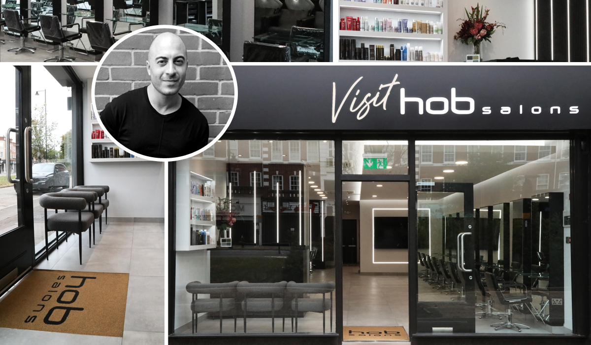
As a franchisee, I was mindful of the HOB brand and the identity it holds. Keeping within the brand was certainly our starting point; monochrome is the norm for HOB Salons, but we opted for softer tones and invested in the lighting which has resulted in it becoming a feature of the salon. We also added other textures such as a wooden wall and a quartz reception desk which have elevated the overall interior to create a really luxurious feel. While it has a similar feel to other HOB Salons, Cockfosters has its own personal touch and distinct features that are unique to us.
WHERE DID YOU FIND THE INSPIRATION FOR YOUR DESIGN?
I love interior design and spend a lot of time searching for inspiration – I researched a lot of current interior trends, but was still conscious of selecting a design that was timeless. I also visited premium retail stores and other salons to gain ideas, as well as using the other HOB Salons design concepts to come up with my own.
DID YOU USE AN INTERIOR DESIGNER?
No, I did it all myself. I’ve been working in salons for more than 20 years and have a strong understanding of what works and what doesn’t. The layout of my salon was important to me, as I think it plays a really important part in the salon experience. I didn’t want the salon to be open plan, for example, as I wanted more privacy at the backwash area. With this in mind, I added a wall to divide it from the rest of the floor space, with dimmer lighting to create a more relaxing experience for clients. This wall then allowed me space to add an 85” TV screen that plays HOB presentations, behind-the-scenes footage of our show work and photographic collections. To be honest, the design really evolved while the salon was being created – even the best designs can spark an idea when it’s being put together!
DESCRIBE THE VIBE CREATED BY YOUR INTERIOR.
I would describe the salon as an open space that’s minimalistic and tranquil. We have 17 styling sections, but the salon never feels squashed as there’s plenty of space between clients. We have created different vibes in designated areas within the salon – the salon space, for example, is filled with great energy whereas the backwash area at the back of the salon offers a more spa-like feel. The minimalistic, clean lines in the design reflect the hair that we are known for.
WHAT DO YOU HOPE ARE YOUR CLIENTS’ FIRST IMPRESSIONS WHEN THEY WALK IN?
We have had some great compliments from clients, especially about the feeling of space.We cover 1300 square feet with 17 stations, and there’s a real buzz in the air – it feels more like entering a community than going somewhere for a haircut!
WHAT ARE THE KEY ELEMENTS OF YOUR SALON DESIGN?
I invested a lot of time and money on selecting the best lighting, creating a drop ceiling with feature lights. The monochrome decor is pebble stone and black, which is softer than white (which I find can sometimes feel a little harsh). We also have a black wooden wall that works well with our concrete floor. The floor not only looks great, but it’s also incredibly easy to maintain. The drop ceiling creates a calming vibe, and the lights complement the natural light we get from the big glass shop front.
DO YOU HAVE ANY CURATED PIECES OR SPECIAL FEATURES IN THE SALON?
Our reception desk is recycled from a previous salon, and I asked the tile shop next door to transform it for me. They did a great job and now it looks a lot more expensive than it is! It’s wrapped in black quartz and is a real focal point. The salon-use cupboard is one of my favourite areas – it stores everything and has charge points for phones and clippers, so there’s not a wire in sight! It was one of the best ideas I had, as the salon always looks tidy and clutter free. It’s the cupboard of dreams!
HOW HAVE YOU EMBRACED SUSTAINABILITY WITHIN THE DESIGN?
Our flooring doesn’t absorb chemicals such as colours, this means it only needs water to be cleaned, allowing us not to constantly use detergents. The desk and stations are all recycled, we also reconditioned everything we could and used LED lighting throughout.
WHAT SALON SOFTWARE DO YOU USE AND WHAT FEATURES OF IT DO YOU FIND MOST USEFUL?
Salon IQ has a useful communication tool, allowing us to regularly communicate and build stronger relationships with our clients. The bespoke reports enable me to measure the performance of each team member, and I can easily track the growth of specific services, client retention and our company KPIs. Investing into great salon software is so important for any business.
WHAT SALON FURNITURE HAVE YOU CHOSEN?
While a lot of it was reconditioned, our styling chairs and backwash are from Takara Belmont.
DO YOU HAVE A DRESS CODE/UNIFORM FOR YOUR TEAM?
Yes, it’s black from head to toe for everyone – apprentices all the way up to senior team members! I just think it looks more professional. When you look at high-end stores, they always have a form of uniform and I believe we have to look better than our clients. Having a dress code encourages the team to look smart whilst also making them easily identifiable.
For related articles, click here