In a new series, BHA Colour Technician of the Year 2020 and Global Colour Director at D&J Ambrose, Clayde Baumann, grants us an in-depth look at each of the stunning images in his winning collection.
Cliched as it may sound, my journey last year started (and ended) with one of immense gratitude. I found myself digging deep and taking stock of who I have become and everything I have achieved.
I did this so that I could use it as a tool to embolden and strengthen my resolve through what has arguably been one of the toughest years in my career, as I’m sure it has been with everyone in our industry.
That sentiment carried me through 2020 and in November last year, I was truly fortunate in being crowned British Colour Technician of the Year for a second time.
It is my biggest wish that I will have every opportunity to share in my success with the rest of the industry and give back as much as I can.
In the coming six features of Professional Hairdresser, I will be sharing my creative processes as well as personal thoughts and feelings around my winning collection, winning image by winning image.
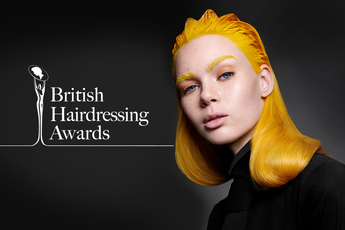
Look One
This look has been a crowd-pleaser garnering a respectable amount of likes and comments on social media and it is to-date one of my favourite images. Originally featured in my 2019 Collection: Opus – this look showcases a fun and energetic yellow presented in a mixture of wet and dry textures with a silhouette that can only be described as quintessentially D&J Ambrose.
Of course there are only going to be a few clients who will wear anything this bold and it’s certainly not everyday wearable hair but then that’s not what I set out to do when I was creating this collection.
Rather it’s there as an image – a productive of a creative thought, produced and shared with you in the hopes that it will inspire you. This inspiration can be taken, moulded and made your own, it’s not there to be duplicated but rather to re-imagined or used as a direction to create something entirely new.
For those who want a more pragmatic way of looking at this image for relevance in 2021 – the obvious catch is the reference to the primary Pantone Colour 13-0647 ‘Illuminating’ which is a yellow.
This colour is described by the Institute as being “one of strength and positivity. It is a story of colour that encapsulates deeper feelings of thoughtfulness with the promise of something sunny and friendly.”
They’ve paired it with a grey which is contrasting not only in colour but also mood and certainly a nod to general social sentiment currently.
Let’s talk technique
In terms of achieving this look, I feel there are two approaches.
These will depend on how vivid and bright you want the result to be versus the condition you want the hair left in or what pre-existing colour history you’re working on.
1: Ultra-vibrant result – I used this technique which is your classic, virgin, full head pre-lightener application with expressive colour tones after.
2: Highlift – This is an alternative approach to pre-lightening hair for warmer results. The concept is that it’s less stressful on the hair and since you don’t need all the yellow out of the hair, a good highlift process should get you where you need to be.
The usual colour rules apply here (i.e not applicable if it’s darker than a base 7, natural red heads or previously coloured hair)
How can you make this colour relevant to every client? Don’t just think hair. You could use this colour inspiration to impress even your most vanilla client.
Talk to her about its relevance and how she can introduce the colour into her wardrobe, makeup palate or nail varnish collection. She may never actually do any of this, but she may be impressed at your knowledge on current trends.