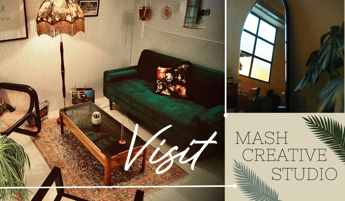
HOW DID YOU DECIDE ON THE STYLE OF YOUR INTERIOR?
I had three goals when creating the space: 1. To have a calm environment for freelancers to work in; 2. To be a multi-functional creative space; 3. To be my own hair home when I’m London based. It was these three main elements that directed my style decisions. I also wanted the space to be as sustainable as I could physically make it, which also had a huge impact on the style of the interior.
WHERE DID YOU FIND THE INSPIRATION FOR YOUR DESIGN?
I love and feel most calm in art galleries and libraries, so we took a lot of inspiration from spaces like that. Elevating the local area was also a key factor, utilising designers such as House of Hackney. The space used to be a photography studio, so I wanted to bear this in mind to bring everything together too.
DID YOU USE AN INTERIOR DESIGNER?
We didn’t use an interior designer, but I love Architectural Digest and I’m an avid watcher of their Open Door series. I’ve really enjoyed curating different interiors most of my life, so this was a fun project to take on myself.
DESCRIBE THE VIBE CREATED BY YOUR INTERIOR.
Sustainable elegance.
WHAT DO YOU HOPE ARE YOUR CLIENTS’ FIRST IMPRESSIONS WHEN THEY WALK IN?
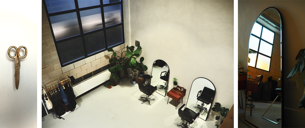
‘Wow!’ The large space and high ceilings give a very impressive first reaction. I would love clients, freelancers and creatives alike to be able to walk into the studio and feel like they can take a deep breath and ground themselves in the space.
WHAT ARE THE KEY ELEMENTS OF YOUR DESIGN?
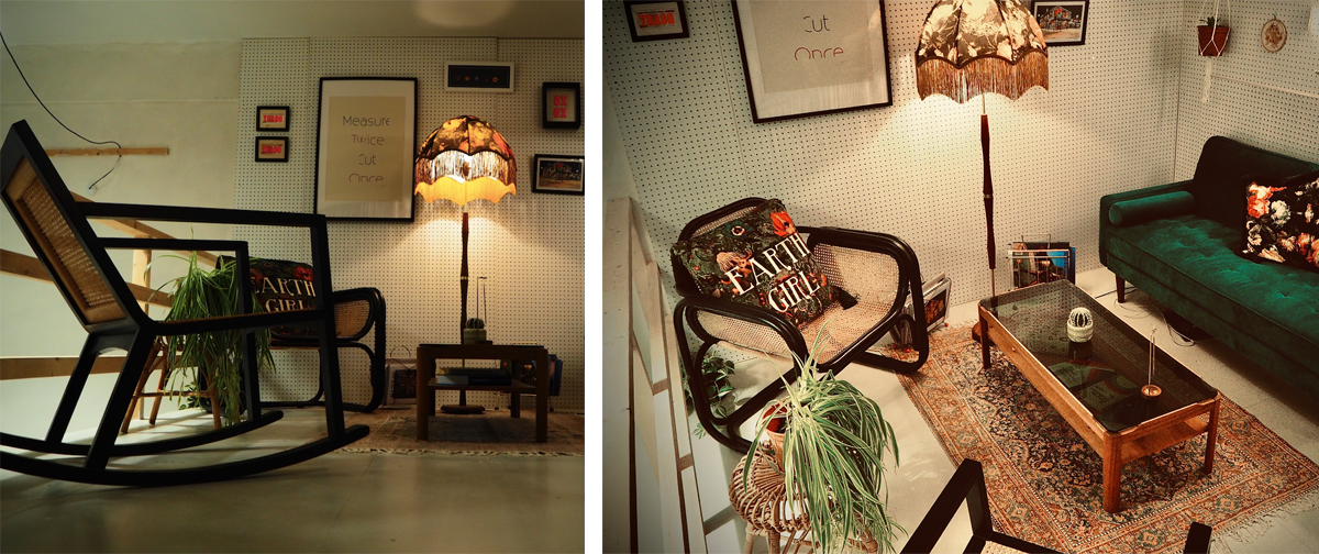
The curated and second-hand sourced furniture, the triple height ceiling with the soft lime-washed walls, the elegant House of Hackney backwash area and the calming mezzanine area.
DO YOU HAVE ANY CURATED PIECES OR SPECIAL FEATURES IN THE STUDIO?
The main special feature is the House of Hackney wallpaper on the ceiling of the backwash area that follows into the large curtain of the same design.
HOW HAVE YOU EMBRACED SUSTAINABILITY WITHIN THE DESIGN?
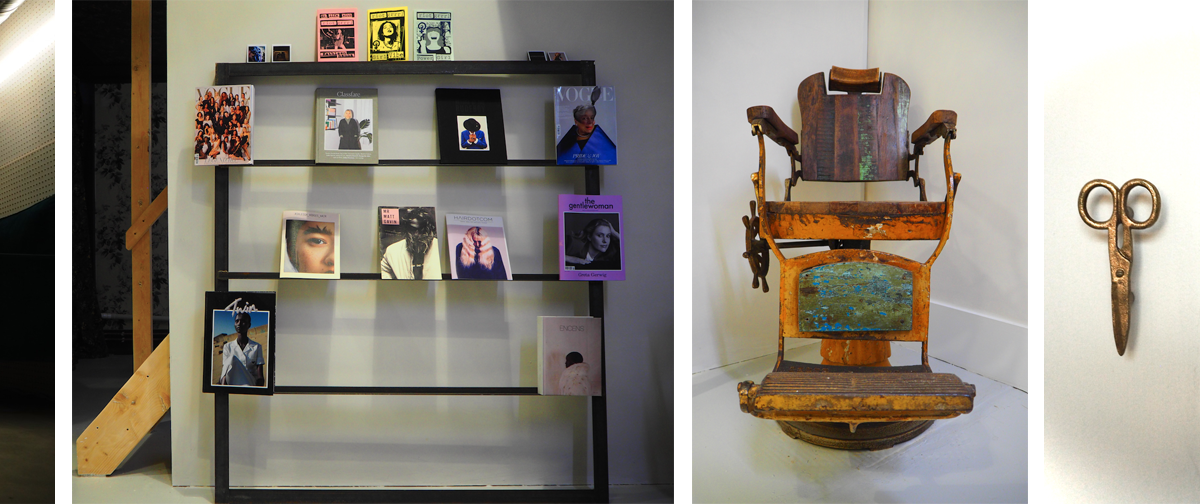
Every element of our design has sustainability at the forefront. Every piece was sourced either from Facebook Marketplace or from local flea markets – from the massaging backwashes to the mid-century pieces. All electronics in the space are either refurbished or sourced second-hand – from the coffee machine to the 4K projector.
Whilst we were building the space, we rented building tools so that nothing had to be unnecessarily bought. We’ve also utilised all the old building materials and remade them into new pieces such as shelving and cupboards. Our whole ethos was ‘the world doesn’t need more stuff’ and that kept us on track with everything we were doing.
Along with our Eco Heads, each basin has an A++ water heater connected to it to save on water and energy. Lastly, plants were a key part of our design for sustainability, naturally purifying our air and giving us a circular movement for our hair waste and water waste.
WHAT SALON SOFTWARE DO YOU USE AND WHAT FEATURE OF IT DO YOU FIND MOST USEFUL?
We don’t use any specific software. Each freelancer has their own software company they like to work with, and we support them with whichever they decide on.
DID YOUR PRODUCT BRAND OR COLOUR HOUSE INFLUENCE YOUR STYLE OF INTERIOR DESIGN?
As a brand-neutral space, it was really important for us to be a blank canvas whilst still keeping our own aesthetic.
WHAT SALON FURNITURE HAVE YOU CHOSEN AND WHY?
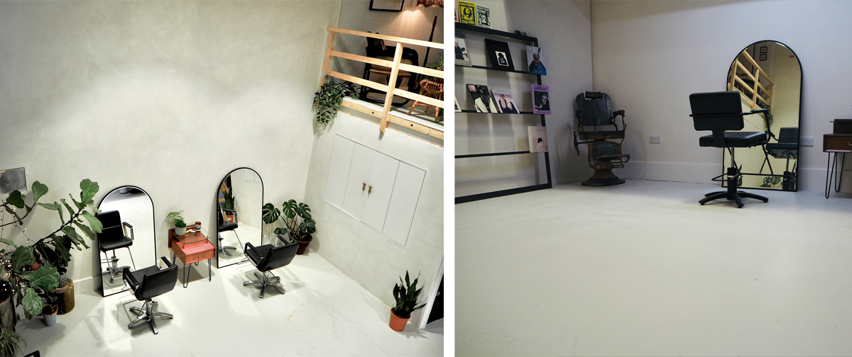
We sourced Pietranera massaging backwash basins second-hand and the furniture team at Salon Supplies were fantastic to work with to restore them. We also went with Takara Belmont chairs – we were gifted two of them from a previous studio space and we sourced two more second-hand from our friends at Sassoon. The chairs work so well as they are simple and elegant within the large space.
DO YOU HAVE A DRESS CODE/UNIFORM FOR YOUR TEAM?
No, we are a creative space and we encourage individualism.
For similar articles, click here